
Creating a calm and peaceful atmosphere in your home starts with the colors you choose for your walls and furnishings. The right hues can help reduce stress, promote relaxation, and make your space feel welcoming and cozy. Whether you’re redecorating a single room or your entire home, choosing calm colors is a great way to enhance your living environment.
In this post, we’ll explore practical tips for selecting calming colors that suit your style and space. From understanding color psychology to mixing shades effectively, you’ll learn how to create a serene home atmosphere with thoughtful color choices.
Why Choose Calm Colors for Your Home?
Colors influence our moods and emotions more than we might realize. Warm, intense colors like bright reds or oranges can energize a space but may also create feelings of restlessness if overused. On the other hand, calm colors—such as soft blues, gentle greens, and muted pastels—tend to have a soothing effect, helping to reduce anxiety and promote calmness.
Choosing calming colors in your home can:
– Encourage relaxation and better sleep
– Provide a welcoming environment for guests
– Help maintain a balanced, clutter-free feel
– Complement a variety of décor styles
Understanding Color Psychology
Before you pick a paint swatch, it’s useful to understand how different colors typically affect moods:
– Blues: Often associated with tranquility and stability, blue can slow the heart rate and calm the mind.
– Greens: Representing nature and renewal, green promotes balance and harmony.
– Neutrals: Soft grays, beige, and off-whites create a clean, airy feel and offer a versatile backdrop.
– Lavender and Soft Purples: Known for their calming and restorative effects.
– Warm Pastels: Light peach, blush, and muted yellows provide subtle warmth without overwhelming the senses.
Avoid very bright or neon colors if your goal is calmness, as these can be too stimulating and make it harder to relax.
Tips for Choosing Calm Colors
1. Start with a Base Color
Choose one main color that will anchor your room’s palette. Light blues and soft greens are popular choices because of their universally calming qualities. Consider how much natural light your room receives—lighter colors work well in darker spaces, while slightly deeper shades can add coziness to bright rooms.
2. Use a Color Wheel for Coordination
Use a color wheel to find complementary and analogous colors that work well together. For a harmonious and calming environment, stick to analogous colors—those next to each other on the wheel. For example, blue, teal, and green blend effortlessly without being jarring.
3. Consider Undertones
Colors have underlying tones that can affect the overall mood. A pale blue with gray undertones can create a cooler and more restful feel, while a blue with green undertones may feel fresher and lighter. Test your paint samples in different lighting throughout the day to see how the undertones appear.
4. Mix Textures and Shades
Calming spaces don’t have to be monochrome or make people feel bored. Mix different textures and shades within your chosen color scheme. For example, pair matte walls with plush cushions or silky curtains in various shades of the same color family.
5. Balance Warm and Cool Tones
If you favor cool colors like blue or green, add subtle warm accents like soft peach or sandy beige to keep the space inviting. This balance prevents the room from feeling too cold or clinical.
6. Limit Bold Accents
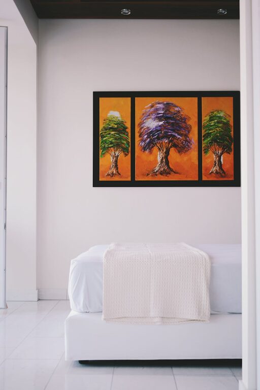
While calm colors dominate the room, you can add small pops of bolder but muted colors like navy, muted coral, or deep plum. Use these for pillows, artwork, or decorative items to add personality without overwhelming the calm vibe.
7. Consider the Room’s Purpose
The function of the space matters when choosing calm colors. Bedrooms and bathrooms often benefit from very subdued shades like pale lavender or pastel green, which encourage restfulness. Living rooms might handle slightly warmer calming colors like soft taupe or light olive for a cozy, social atmosphere.
Practical Steps for Choosing Your Colors
- **Gather Inspiration:** Create a mood board with images, paint chips, fabrics, and décor ideas that reflect calm colors you like.
- **Buy Paint Samples:** Test several colors on your walls before committing. Paint patches of different sizes and observe under natural and artificial light.
- **Live With It:** Spend a few days with the samples on your wall to see how you feel at different times of day.
- **Think Beyond Walls:** Consider calm-colored rugs, textiles, and furniture to complement or contrast your base color.
- **Ask for Opinions:** Sometimes a fresh perspective helps ensure your color feels as calming to others as it does to you.
Additional Tips to Enhance a Calm Home Environment
– Use Soft Lighting: Choose warm, adjustable lights to enhance the effect of your calm color palette.
– Incorporate Natural Elements: Wood tones, plants, and natural fibers add warmth and grounding textures.
– Keep It Simple: Avoid overly busy patterns or excessive clutter to maintain a calm, restful feel.
– Personalize Wisely: Select décor pieces that bring joy but don’t overstimulate the senses.
—
Choosing calm colors for your home is both an art and a science. With these tips, you can create spaces that feel like a sanctuary, a place where you can unwind after a busy day or welcome friends in relaxed comfort. Remember, the best color palette is one that reflects your personality and makes you feel truly at home. Happy decorating!